You Can Judge a Book by Its Cover
Typography might not be the first thing that comes to mind when browsing for your next cozy mystery, but it’s the unsung hero of cover design. Typography sets the stage before a reader even opens to the first chapter, signaling, “Get ready for a story that’s magical, lighthearted, and maybe a little mischievous.”
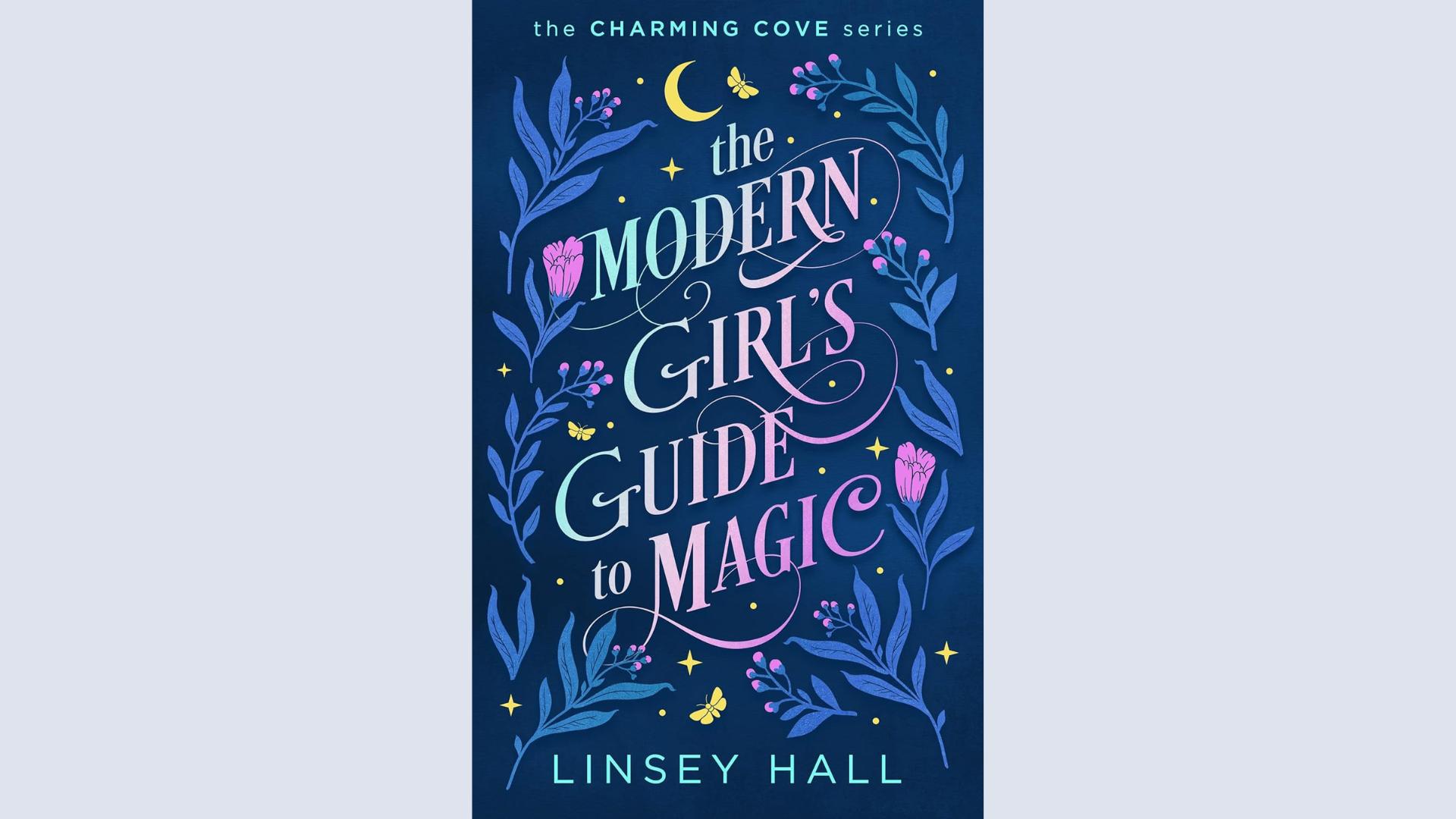
Linsey Hall’s book, The Modern Girl’s Guide to Magic, shows how the right typography can elevate a cover to extraordinary heights. What makes it shine? Here’s why the typography caught my eye.
A Font that Speaks to the Story
What’s the first thing that stands out on The Modern Girl’s Guide to Magic? The swirling, playful script. The font feels enchanted, with loops and flourishes promising a story full of whimsy and charm. From a glance, it’s clear the book isn’t a gritty thriller—it’s a cozy, spellbinding tale. A cover should announce, “Here’s the vibe. Come in and stay a while,” and Hall’s design does exactly that.
Readability is Key
Many covers stumble when it comes to readability. If a title gets lost in an elaborate font or blends into the background, potential readers might scroll past without a second thought. Hall’s cover avoids that trap. Even at thumbnail size, the title remains clear and eye-catching. The gradient of soft pinks, purples, and blues lifts the text off the dark background and pulls readers in for a second look.
Typography that Plays Well with Other Elements
Typography shouldn’t stand alone. It needs to blend into the story the entire cover tells. On Hall’s cover, the title flows effortlessly among the illustrated elements: leaves, stars, and butterflies. The text doesn’t look like an afterthought; it feels woven into the magic of the design. This seamless integration makes the cover cohesive and professional.
Little Details, Big Impact
Look closely, and tiny stars appear woven into the lettering. Subtle touches like these add depth and a sense of fun without overwhelming the design. Every part of the cover, down to the smallest detail, feels considered. Typography with layered details transforms from functional to engaging.
A Balance of Fonts
Typography involves more than the main title; it’s about how all text elements work together. On Hall’s cover, the series title at the top uses a modern sans-serif font that contrasts beautifully with the intricate main title. The author’s name in a clean, straightforward typeface at the bottom balances the composition and keeps the focus on the title. Every choice feels intentional and thoughtfully placed.
Why Typography Matters for Your Cozy Mystery
Typography acts as a silent storyteller. It sets the tone, hints at the genre, and sparks curiosity before a reader opens the book. The Modern Girl’s Guide to Magic demonstrates how typography can become more than functional; it can be enchanting. Choosing the right font and integrating it into the design can transform a good cover into a standout.
Next time you browse cozy mysteries, take a moment to notice the typography. Which covers draw you in, and which ones make you pass by? And if you’re an author, remember: your cover’s font isn’t simply a font. It’s a welcome sign to your readers, inviting them into the world you’ve created. Done right, it says, “You’re going to love it here.”
What Do You Think?
What do you like best about Linsey Hall’s book cover? Share your thoughts in the comments.
Buy My Books
If you like this article and you want to support my work, buy my books on Amazon.

